

Historical returns won’t save you
Yes, I’m back after a long hiatus for a series on Asset Allocation. This is the first in a three part series on Asset Allocation. Read Part 2 here and Part 3 here.
If you’re part of the Financial Independence (FI) community, you’ve probably built your retirement dreams on a pretty common assumption: stock market returns average 8–10%.
To be fair, the S&P 500 has delivered, hitting a 10.2% compound annual return from 1928 through 2024. Popular FIRE calculators like Networthify err on the conservative side and dial it down to a 5% real return (which could be about 7.5% nominal), while others like Engaging Data and Choose FI stick closer to 8% nominal.
Even big brokers like Vanguard and Fidelity, while sometimes using lower real return assumptions (Vanguard’s default is 5%, for example), can be a bit confusing. Click around, and you might see historical returns ranging from 6.1% for bonds to 10.3% for a 100% stock portfolio.
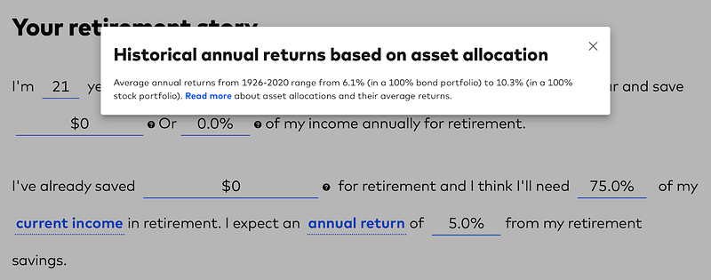
To be fair, Vanguard’s 5% is in real (inflation-adjusted) dollars, but that’s not totally obvious to a newbie investor. When I first started, I took the historical numbers at face value and cranked up my expected returns to match. I had no idea that “historical returns” and “expected future returns” were two entirely different things!
Looking back, that was a mistake. Those higher return assumptions made my projected retirement date look way closer and probably pushed me to invest more aggressively than I should have. I was more willing to take risks because the potential reward seemed so high.
Those fixed average return numbers in retirement calculators? Tweak that return rate by just a tiny bit, and suddenly your projected retirement lifestyle looks wildly different. This uncertainty, often brushed off as “guesswork,” really highlights why we need a more realistic approach to investing that incorporates expected returns not just historical returns.
Decoding the market’s crystal ball: the CAPE ratio explained
Ever heard of the CAPE ratio? It’s also known as the Shiller P/E or P/E 10 ratio, named after Nobel Prize winner Robert J. Shiller, who really put it on the map. This valuation measure takes the current price of a broad stock index (like the S&P 500) and divides it by the average of its inflation-adjusted earnings over the past ten years. Why ten years? It helps smooth out the crazy ups and downs of business cycles and short-term earnings, giving us a clearer picture of a company’s true earning power.
Research by Campbell and Shiller back in 1988 showed that the CAPE ratio is fairly good at predicting how stocks will perform over the long haul — think 10 to 20 years down the road. When the CAPE ratio is high, future stock returns tend to be lower. And when it’s low, you can often expect higher returns.
So, what’s the CAPE ratio telling us today? As of July 2025, the S&P 500 CAPE ratio is sitting around 37.81. These numbers are way higher than the 20th-century average of 15.21 and have only been topped during wild market times like the “tech bubble” (1998–2002) and the recent post-pandemic peak (2020–2022).
The Cyclically Adjusted Earnings Yield (CAEY), which is just the CAPE ratio flipped upside down (1/CAPE), gives us another angle on expected returns.
The plot below shows monthly CAEY (earnings yield) of the S&P 500 vs. the nominal annual compound growth rate 10 years in the future for 634 10-year periods from 1962–2024. The trendline is clearly positive, although there can be a lot of noise around the edges.
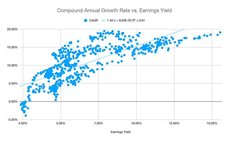
Right now, the CAEY is around 2.64%. If you use the historical trendline, a CAPE ratio in the 36–38 range suggests nominal 10-year returns of roughly 4.7%. After you factor in inflation (the current market implied inflation rate is 2.4%), that translates to real returns of about 2.3% (a tiny 0.5% capital return plus a 1.8% dividend yield).
Are you really willing to take on all that stock market risk for a potential return that’s barely better than what you could get from super-safe, inflation-protected bonds? 10 Year TIPS, which are currently yielding about 2.01% in real terms as of July 2025, provide about the safest real return you can get, US sovereign debt downgrades aside.
What this tells us is that the “equity risk premium” — that extra return investors usually demand for taking on stock market risk — is shrinking. The high CAPE ratio, leading to a low CAEY, means expected stock returns are looking pretty slim.
Here is a summary of the current market valuation along with some historical figures for context:
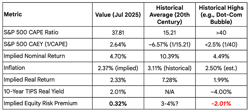
Note that these are all estimates based on available data and my own calculations and can quickly get out of date. Nonetheless, it is hard to miss what is going on here. Stock valuations are historically pretty high and with a decent yield on TIPS, the equity risk premium is next to nothing at 0.32%.
Also, for simplicity purposes, I don’t use the formula in the scatter plot above (1.45*CAEY + 0.00863) for estimating real returns. The line is not law and is certainly guilty of overfitting. For simplicity purposes, I just use the CAEY as an estimate for real returns–it is the earnings yield after all! It is easy to find online and 2.64% is “close enough” to 2.33% for my purposes.
Random rant: How insane was the Dot-Com bubble? In the year 2000, people were investing in stocks at a CAPE ratio above 40, while TIPS were yielding above 4%, implying a negative 2% equity premium! In retrospect, it seems obvious that the smart move would have been moving out of stocks into bonds.
The CAPE controversy: understanding its limitations
Now, before you go all-in on CAPE, let’s be clear: it’s a fantastic tool for long-term insights, but it’s not a crystal ball for predicting the next market crash. While high CAPE values have come before big market drops (like in 1929 and 2000), focusing only on those times can make us forget other periods where a high CAPE didn’t lead to immediate weak returns or crashes, like in the mid-1960s and mid-1990s.
But like any good tool, it has its quirks and critics. It is backward-looking and doesn’t take into consideration modern accounting rules, stock buybacks and reinvestment. Over time, the CAPE ratio has gradually crept higher (something I’ll talk about in a later article) and has a pretty shaky record at predicting real returns (the dot plot above was nominal returns).
These criticisms remind us that valuation metrics aren’t perfect. While the basic idea that a high CAPE means lower long-term returns still holds true, just blindly following the CAPE ratio without understanding its history and context can lead you astray. The takeaway here? No single number tells the whole story. The smartest move is to use CAPE as one piece of the puzzle, combining it with other forward-looking clues and remembering it’s not a precise market-timing signal.
Investors should consider multiple factors, including what kind of return they need and their risk aversion, when deciding where to put their money. Simply bailing on stocks because the CAPE ratio looks high might not get you the results you want. The best strategy often involves mixing insights from different ways of predicting returns.
So, if relying on historical averages is a myth, and even the powerful CAPE ratio has its limits, how do we build a rational, systematic way to allocate our investments? In the next article, we’ll dive into a framework called the Merton Share, and explore how it can help you align your portfolio with your investing horizon, risk appetite, and current market valuations, without constant tinkering. Stay tuned!
